|
Mapping out illustrations for visual presentation:
Grabbing the reader with graphs and graphics
Gaston de Rosayro
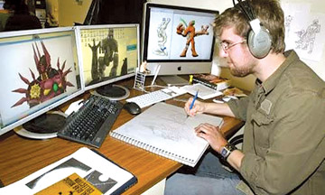 |
| Graphic artist
in a news paper |
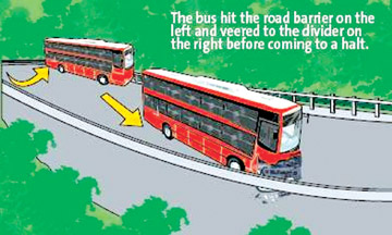 |
| Graphic of a
road accident |
Last week we talked about photographs and discussed the captioning of
pictures. But there are other kinds of pictures which can also tell the
news and give your pages a lift at the same time. If you have the
chance, do get a graphic artist on to the staff of your newspaper or
magazine. They can do a lot of valuable work, preparing the kind of news
graphics which we shall discuss here.
While many people enter the profession of journalism because they
like to write and consider themselves 'word people,' the importance of
visual presentation of information in journalism cannot be
underestimated. Visual journalism takes in photojournalism, graphics
journalism and publication design. Few things in our culture have more
impact than the single, still photograph. Photographs have a way of
grabbing our attention and telling a story that stays with the viewer
long after we have stopped looking. Capturing such images is no
accident. They take time and planning on the part of the journalist.
Graphics journalism - presenting information through charts, graphs,
maps and illustration - is a growing part of the profession.
Publications understand that some information is more efficiently and
effectively presented through these means. Many publications are
actively seeking people who understand graphic forms and the kind of
information that is necessary for their use. No publication or web site
exists without the hand of a good editor who can instruct a designer.
Every editor must understand how information should be presented
visually so that the news consumer can see it and so that the news
organisation has a distinctive look that reflects its goals and
philosophy. The best editors know not just design but also have
excellent news judgement. They understand the profession, and at many
publications they end up making key decisions not just about design and
layout but also about the content itself.
|
Graphic art of a building |
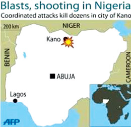
Showing the location of the country where the news is happening |
There are four main kinds of graphics which you are likely to want to
use. One of the basic questions which journalists need to answer in the
basic four Ws format is Where? One of the best ways of answering this
question is by publishing a map. For a foreign news story, this can be a
map showing the location of the country where the news is happening. For
a national story, it can be a map showing whereabouts in the country the
town is, where the news is happening. You can even use a street map,
showing whereabouts in the town the news event happened.
The best maps for use in newspapers contain as little information as
is necessary, and have all the lines drawn boldly. Do not try to
photocopy a page from an atlas, which is full of contour lines and
rivers, and expect it to communicate clearly with the readers. Get your
graphic artist to draw a simple map, using the atlas as a guide. Some
maps can have an inset, showing the location of the main map.
Remember, too, that all the lettering on the map must be easily
readable, even after the map has been reduced in size for publication.
The usual rule is that no lettering on a map (or other graphic artwork)
as it appears in a newspaper should be smaller than nine point. Then
there are graphs and charts. When the story depends on comparing sets of
figures, it may be easier for the readers to understand if they are
presented in graph or chart form.
Many small personal computers can now generate artwork of this kind,
if you have the right software. Even if you do not, they can be simply
prepared by any graphic artist. Once again, it is important to remember
that all lines should be drawn boldly, and that the chart or graph
should not be crowded with too much unnecessary information. Sometimes a
drawing can illustrate a story more effectively than a photograph can
do.
A news story about a dramatic rescue of a child from the side of a
cliff, in bad weather, may be difficult to illustrate with photographs
for several reasons. First, the weather was bad, so all your photographs
are pale grey and fuzzy. Second, the rescue took a couple of hours, so
there was no really decisive moment to photograph. Third, the best
vantage point from which to see what was happening was in mid air, 40
metres above the sea. An artist can overcome all those problems. In the
drawing of the cliff, the reader can be taken out into mid air, just out
from the cliff, for the best possible view. In the drawing, the mist and
driving rain can be cleared away, so that everyone can see clearly what
is happening. And in the drawing, all the stages of the rescue, over two
hours, can be shown together, clearly numbered so that the readers can
understand the order in which things happened.
Drawings can also be useful in illustrating features. If the feature
can be given to a good artist several days in advance, it may be
possible for the artist to create a drawing which captures the point of
the feature in a way which no photograph can do. Whether or not you will
use drawings will depend on whether or not you have a good artist
available. If you have, use them as much as possible.
Then there are drawings on photographs. There are some stories which
need a combination of photographs and drawings to be told clearly. If
the site has been cleared for a new hospital to be built, how can you
illustrate this? A photograph of a cleared site will be very boring. One
possibility is to photograph the whole site, ideally from a high vantage
point (perhaps you will be allowed to go up into a crane on the building
site) and then get an artist to draw on the photograph how the hospital
will look on this site when it is built. To do this, you will need the
architect's drawings or a model of the finished building. Similarly, if
a car has run out of control in the city centre, bumping into other cars
and traffic signs before finally running across the footpath and into
the front of a shop, you might be able to show all of this in one
picture. A photograph of the whole scene (again, preferably taken from a
high vantage point) can be drawn on by an artist, to show the car's
eventful journey down the street. A line, going from side to side, with
a short caption at every 'bump', might tell the story well.
All journalists, even though they may not be visually orientated,
should have a knowledge of visual and graphic principles and how they
work in the presentation of information. Purpose and content should be
the chief considerations in the design of a graphic, not the ability of
a computer program to design a fancy or pleasing picture. Design should
always give way to function.
Accurate presentation of information is the chief goal of a graphic
journalist. And you must have an eye for depth. Don't overdo anything
such as making a two dimensional graph appear three dimensional. It may
have its problems. Adding this quality to a graph may distort its
meaning and should be done with care.
Just as good journalistic writing often takes the simplest form
possible, good graphics should also be as simple as possible. The most
commonly used graphic forms in journalism are the pie chart, the bar
chart, the line chart and the map.
Each has a set of conventions for its use that journalists must
understand and observe. Journalists should look for ways to use graphic
forms to present information, particularly with the regard to the
location, numbers, process and content of an article.
[email protected] |


")

