What is the ugliest election ad you’ve seen?
 There are so many clever, clean, mature, experienced, honest, brave,
innovative, with-of-and-for-the-people people contesting this election
that I have stopped looking for message in campaign posters. After
seeing thousands of posters and hundreds of versions of the same “I am
it” (or, to put it in Sinhala parlance Mamai Pora) syndrome, they all
appear like a blur, bluish-greenish hue that flanks the roads I take. There are so many clever, clean, mature, experienced, honest, brave,
innovative, with-of-and-for-the-people people contesting this election
that I have stopped looking for message in campaign posters. After
seeing thousands of posters and hundreds of versions of the same “I am
it” (or, to put it in Sinhala parlance Mamai Pora) syndrome, they all
appear like a blur, bluish-greenish hue that flanks the roads I take.
The same goes for hoardings. There are so many campaign hoardings
that I have taken to pretending that companies and brands are actually
political parties and that models are candidates. “Do you think she’ll
win?” I ask whoever happens to be near me.
“Who?” That’s the natural reply. “That girl there, in the hoarding,”
I explain. “That’s an ad, you moron!” I feign embarrassment and say, “I
thought”. Another slogan “An investment for the future!” I can’t resist.
“Do you think they will get any seats?” “Who?” “Whoever put that
brilliant hoarding?” “It’s a bank, you nutcase!” “A bank? I thought it
was a political party,” I show amazement.
I think that brands and companies that have succeeded in obtaining
some kind of presence at a time when the electioneering monsoon
vandalises all public and private spaces available should get some
award.
“We survived an election,” a soap manufacturer can say in a
post-election ad, for example. I don’t see campaign posters, let me
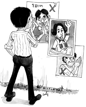
repeat. They are all a blur. For the most part. Some, though, are so
in-your-face that one can’t help but notice. It puts me off the
candidate immediately and I do make a mental note to cross the
particular candidate and number off my list of potentials. It is perhaps
heartening for candidates to know that some posters do jump out of
colour and blur for one of two reasons: sheer advertising brilliance or
advertising ‘abysamlity’. This is about the latter kind.
 Two things. First a poster. It’s the first Ranil Wickremesinghe
poster that I saw. Someone was wishing the rajyathanthrikaya (statesman)
‘Happy B’day’. I think rajyathanthrikaya has a dignified ring to it. It
is an idea that can be developed, but then again Ranil Wickremesinghe
has built for himself a considerable reputation as an unmarketable
phenomenon. What wrecked the poster was the image. I know that Ranil is
not exactly photogenic but when one has been in the limelight for as
long as he has there’s bound to be at least one that came out right. In
any case in these photoshop days one can do really turn a frog into a
prince, not that Ranil is either of course. What I saw was a themichcha
kukula. Two things. First a poster. It’s the first Ranil Wickremesinghe
poster that I saw. Someone was wishing the rajyathanthrikaya (statesman)
‘Happy B’day’. I think rajyathanthrikaya has a dignified ring to it. It
is an idea that can be developed, but then again Ranil Wickremesinghe
has built for himself a considerable reputation as an unmarketable
phenomenon. What wrecked the poster was the image. I know that Ranil is
not exactly photogenic but when one has been in the limelight for as
long as he has there’s bound to be at least one that came out right. In
any case in these photoshop days one can do really turn a frog into a
prince, not that Ranil is either of course. What I saw was a themichcha
kukula.
I make no bones about the fact that I have never been a supporter of
the United National Party. Still I have always thought that the UNP was
a political machine where things were driven by efficiency and
professionalism (both employable for the good and bad). I remembered the
2004 campaign and I thought to myself, “well, they were pretty bad even
then”.
I was in for a shock when I opened the Lankadeepa. There was an
appeal to the postal voters, most of whom are public sector workers. I
tried to think of a good word to describe it. I considered several and
decided to go with ‘ugly’: ‘Ugly’ in composition, ‘ugly’ in terms of
inappropriate image (a smiling and looking-good public sector worker
indicates that the Government has made him happy), and ‘ugly’ in terms
of caption.
Obata ratata saru genenna wenas karamu aanduwama was the line. I
think it was a call to change the government in order to bring
prosperity to public sector employee and the country. Saru genenna?
There is no term like that in Sinhala! It sounds like a direct
translation from the Engish, ‘Bring Prosperity’. The better term would
be Saru Karanna, translatable as ‘To make prosperous’ (sounds bad in
English, but not as bad as the Sinhala version of the English term that
I believe inspired it in the first place).
This was not Mr. Trying-His-Best-Candidate from a three wheel party,
mind you. This was an ad taken by the United National Party, a political
entity with more experience than any other party in the country and one
that gave us the notion of a just and free society and the heavily
lampooned but extremely effective teaser, me kawda monavada karanne (who
is this and what is he doing?) when Ranasinghe Premadasa ran for
President in 1988.
I had one word when I saw the ad: UGLY. Now, as I end this piece,
there’s another word. SAD.
[email protected]
|


")


