Don't judge The Bell Jar by its cover
Faber's new cover for The Bell Jar may be garish, but if it finds a
new audience for Sylvia Plath's novel then who cares?
It may have first come out 50 years ago, but The Bell Jar still
causes controversy. The anniversary has seen all the old arguments and
enmities boiling over again, but this book strikes such a nerve that
even a new cover can start a row.
Writing on the LRB blog, Fatema Ahmed pours scorn on Faber's "silly"
50th anniversary edition, calling it a woefully inappropriate attempt to
rebrand the book as chick lit. She quotes the always reliable Twitter
feed from Melville House asking: "How is this cover anything but a 'fuck
you' to women everywhere?" and Andy Pressman, a graphic designer, who
derided the new cover as "awesomelycomicallyhistorically inapprop" and
said: "And by 'historically' I mean 'incorrect on a scale of which we
have few historical precedents', not 'That typeface didn't exist in that
era'."
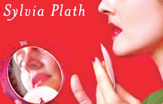 |
|
The new
cover for The Bell Jar |
There is a strong argument against the new design. Ahmed says:
"The anniversary edition fits into the depressing trend for treating
fiction by women as a genre, which no man could be expected to read and
which women will only know is meant for them if they can see a woman on
the cover."
I can see where she's coming from. That is indeed a depressing trend.
And the cover does indeed look a bit like those other garish covers that
supposedly only appeal to women.
While I'm notching up the negatives, there's also the simple fact
that the original cover by Shirley Tucker is a thing of great beauty: a
timeless classic that is to the new cover as a single-malt is to tar
water.
But, here's the thing. This latest edition has sold truckloads. The
official figures aren't out yet, but Faber have assured me it's doing
the business. There's no evidence that this cover has ostracised a
potential part of its audience, but there is already some that it has
helped the book reach a new generation of readers.
Okay, this is an inexact science, and perhaps those sales should be
attributed as much to the 50th anniversary publicity and renewed
interest in the author as they are to that garish red cover.
But the fact remains that the book is selling - and quite possibly
reaching a new audience, as Faber claim is their exact intention. Hannah
Griffiths, publisher of paperbacks at Faber, says they were aiming for a
more "welcoming package" in the belief that "there is a reader for this
novel who could enjoy its brilliance without knowing anything about the
poetry, or the broader context of Plath's work".
Of course, as soon as anyone picks it up, breaks the spine and reads
that first sentence they'll know they're in for something different. "It
was a queer, sultry summer, the summer they electrocuted the Rosenbergs,
and I didn't know what I was doing in New York."
Hardly Sophie Kinsella, is it? I even quite like the idea of someone
mistaking the book for a sexy summer beach read and falling headlong
into Esther Greenwood's cruel world.
What's more, those actually reading the novel - rather than judging
the cover - may even see something in that blood red, in the queasy
glamour of the 50s model checking her makeup, in the serious face in the
mirror. It certainly conjures up a time and place, a sense of nausea and
introspection.
The novel's Esther Greenwood would probably mock the new design
mercilessly, but that too seems appropriate. Perhaps it's right that she
is at odds with the world in which she finds herself and the way she is
presented? Perhaps this new cover isn't quite so silly after all?
The Guardian
|


")


