Learning to control water-colour washes
Tissa HEWAVITARANE
Colour mixing in water-colour can be both fascinating and
frustrating. Sometimes magical things happen, other times a colour will
turn to mud for no apparent reason.
This article deals with the practical problems involved in
controlling such an unpredictable medium as water colours, and shows you
how to avoid the pitfalls of both muddy colour and weak washed-out
colour. In addition you'll discover how to improve the vibrancy of your
colours by mixing them wet-in-wet or applying them in transparent
glazes. First I will deal with problem.
The problem
In water colour, there is no more thrilling sight than that of big,
soupy washes of colour being brushed onto a sheet of sparkling white
paper and allowed to diffuse softly together. The effect is magical and,
to me, wet-in-wet washes are the very foundation of water-colour
painting. Yet so many beginners miss out on all this fun because they
are afraid that they won't be able to control wet washes. Instead they
just sit frustrated over the paper, making dry little marks with dry
paint on dry paper. And then they wonder why their water-colours don't
look water colours.
Solution
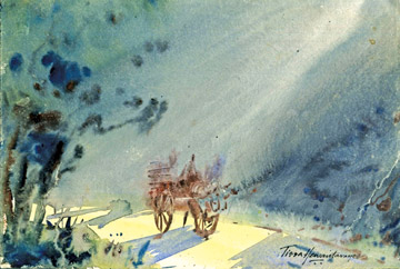
Learning to control water-colour, washes can be nerve-wracking at
times, but it is also exciting and exhilarating. Observe the bold and
confident handling of wet-in-wet wash I have done in this painting
related to this article. Dry on wet strokes are used to create an
impression of a misty morning. To develop your confidence in handling
paint in this way, try working on large sheets of paper than you might
normally use. A too small painting area is often the cause of tight,
constricted brush strokes.
 When you're learning how to handle water-colour, remember the three
P's: Patience, Perseverance and Practice. You will need patience because
depending on the humidity and the type of paper you're working on, water
colour washes may dry more slowly or unevenly than you anticipate. To
avoid back burns and muddy colours, you must be prepared to allow one
wash to dry before adding another colour on top (unless you're working
wet-in-wet). When you're learning how to handle water-colour, remember the three
P's: Patience, Perseverance and Practice. You will need patience because
depending on the humidity and the type of paper you're working on, water
colour washes may dry more slowly or unevenly than you anticipate. To
avoid back burns and muddy colours, you must be prepared to allow one
wash to dry before adding another colour on top (unless you're working
wet-in-wet).
Generally, the best time to apply a second wash is when the shine has
just left the first wash. You can judge this by holding your board up to
the light, horizontally and at eye level. It is always good to try out
different water colour papers and test how they respond to wet washes –
by scrubbing and lifting out paint, scratching out and so on. Different
papers behave in different ways, depending on materials they are made
from and on their surface coating. Your control of the paint can be
helped or hindered by the absorption of the paper, which can be
discovered only through practice. In water colour there are four ways to
apply paint to paper; wet on dry; dry on dry, dry on wet, and wet on
dry.
Generally you should aim to include at least two different kinds of
brush strokes in a painting to give it variety and textural interest.
Dry on dry
When colour is picked up on a dry brush and skimmed lightly over dry
paper, a rugged broken stroke is created. This method known as dry
brush, can be highly expressive in suggesting rough, weathered textures
or the sparkle of sunlight on distant water. Never labour dry brush
strokes. Use quick, light movements. This technique works best on medium
or rough paper that helps to break up the paint.
Wet on dry
Controlling shapes is easy when you apply paint to dry paper with a
wet brush. The paint stays right where you put it and dries to a clean,
hard edged shape. If over-used however, this method can make a painting
look rather static and lacking in atmosphere.
Glazing, however, is a wet-on-dry method that will enrich any
water-colour painting. When a thin transparent wash is applied over
another, dry, colour, the effect is more vibrant than when two colours
are mixed together on the palette. Never attempt a glaze unless the
underlying wash is bone-dry, otherwise the under wash will be disturbed
and the colours will mingle and turn muddy. Always work quickly and
lightly when glazing. Don't glaze more than two or three layers of
colour. And finally use only the transparent colours, such as alizarin
crimson and viridian. Opaque colours like cerulean blue and yellow ochre
are not suitable for.
Dry on wet
In this method a dry (damp) brush is loaded with paint and applied to
wet paper. The deposited paint (pigment) swims on the wet surface before
settling into the fibres of the paper, forming a shape with diffused
ages. Because the paint is relatively thick it doesn't spread too far,
so you get attractive effects while retaining some control over the
shapes you make.
Wet on wet
Now we come to the most beautiful, the most expressive, and the least
controllable method. Again, the paper is wet, but this time more water
is carried in the brush.
The deposited pigment, being more diluted, floods out and into the
wet paper and creates exciting diffusions and colour interactions that
you could never equal if you planned them. Of course, the potential for
disaster is there too, streaks and “back burns” being the main problem.
Decisions before you paint
Careful decisions has to be maid before you start painting especially
outdoors. What kind of day is it? Where is the sun whether it is too hot
or low? Is it going to be a rainy day or windy? Windy conditions can be
most trying to temper when gusts make your paper flap and threaten to
blow your easel over.
As to the problems of a sunny day or hot day. Whenever possible try
not to paint with the sun direct on your paper. I know it can't be
avoided always. Avoid painting in the middle of the day with the hot sun
directly overhead, it is much cooler before ten in the morning or after
five but the lighting shadows will differ. Probably the easiest
condition to work under is a bright but overcast light.
There are no hard shadows or extreme points of glare yet there is
plenty of contrast. Another advantages is that the light usually remains
constant over a long period and you have a much longer painting time as
the sun can travel for ours above thin cloud without any obvious change
in landscape.
There is no answer is rain. It can ruin a water-colour in ten seconds
flat so don't try to start painting even it is cloudy. There can be few
atmospheric effects more fascinating and mysterious. Mist lends itself
ideally for portrayal in water-colour.
Mist has a distant colour of its own which may be a cold grey or even
have a yellow tint. For example, when the sun is struggling to break
through a morning mist everything in the picture is in various tones of
this golden colour.
The painting I have done titled ‘Misty morning’ will show the dark
and the light and the approach to wash work.
The atmospheric effect of mist and sunlight is achieved with weak
washes of cobalt blue, burnt sienna and cadmium, yellow, applied
wet-in-wet.
The sharpest details in the picture is the bullock-cart in the centre
of the picture to pale delicate tints with man seated on the cart, which
form the centre of interest. Dry on wet strokes are used to create an
impression of misty trees on the left. Here is an excellent example of
how to use water-colour with controlled freedom.
Www.tissahewavitarane.com
|


")
