Get water to look like water

Water and painter
* Landscapist has years of practice
* River, sea and waterfalls inspire painting
of water
* Still water resembles a horizontal mirror
* Constantly moving water makes an
inexperienced artiste hopelessly confused
 To
become a skilled landscapist takes years of practice. The most common
elements of landscapes, the majority of which like creating skies and
trees in the distance, can be applied in general landscapes. Painting
water is, nationally part of river scenes, sea views and water falls.
One nice thing about water, it has rhythm in its movement and will
generally repeat the sequence so you can that fleeting moment again....
and again...... and again. To
become a skilled landscapist takes years of practice. The most common
elements of landscapes, the majority of which like creating skies and
trees in the distance, can be applied in general landscapes. Painting
water is, nationally part of river scenes, sea views and water falls.
One nice thing about water, it has rhythm in its movement and will
generally repeat the sequence so you can that fleeting moment again....
and again...... and again.
Still water is like a horizontal mirror. Study its movements
carefully and then paint a generalization of its movements. The brush
strokes should follow the action of the water. Don’t put down every rock
and ripple, since rushing water looks best when understated.
The lack of detail immediately brands it as a rapidly moving stream.
The only way you might catch its ‘one moment’ is to photograph it and
that might be a good way to work.
Why is it the painting water so often goes wrong?
Undoubtedly the main cause of failure is over-elaboration. The
problem is that, when you really start to look at it, even the calmest
water is constantly moving and changing. Ripples and eddies come and go;
reflections stretch and shrink; patches of light wink on the surface and
disappear.
The inexperienced artist pounces on every one of these elusive
details, like a kitten chasing butterflies, and ends up getting
hopelessly confused. Worse still, with every stroke of paint applied the
painting becomes more cluttered, and what started out as a river or a
lake begins to look move like a patterned carpet.
The solution
You’ve probably heard the saying “Less is more”, and now where does
this apply move readily than in the painting of water. Achieving the
smooth, glassy look of water requires surprisingly lilt effort; often a
few sweeping strokes with abroad brush on damp paper are enough to
convey the effect you want.
Be decisive
Whether you apply your colours to dry paper or damp paper is a matter
of preference, but here’s one important piece of advice; choose your
colours with care and apply them with confidence. The more decisively
and simply you paint water the wetter it looks, so try to work with
large brushes that discourage the habit of fiddling and prodding and use
plenty of water to facilitate smooth, even strokes. Mix your colours
carefully on the palette and test them on scrap paper before committing
yourself, remembering that they should appear quite dark in tone to
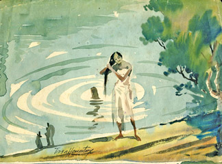
allow for the fact that they will fade a lot on drying. In the painting
I have shown sharp contrasts of tone between water and reflections,
Ripples are larger, and denser ripples indicate water receding into the
distance. Note the contrast between the water, which is painted with
thin paint and very light tones and surrounding solid shapes make the
water appear more fluid through contrast.
To get a good result, it is necessary to bear in mind that the
reflections painted in water colours depend fundamentally on two things
the background of the composition and the dark colour that is used for
the reflection.
www.tissahewavitarana.com
|


")


