Floral - still life
 Before
beginning to paint any still life, it is indispensable that the artist,
prepare the subject that is going to be painted. It is necessary to have
available the things that are going to be the subject. Before
beginning to paint any still life, it is indispensable that the artist,
prepare the subject that is going to be painted. It is necessary to have
available the things that are going to be the subject.
|
Flowers viewed from the back can be just as interesting as those
viewed from the front |
It can be flowers, fruits, pots, or combination of objects which
offer an adequate composition for the picture. With the required
material put out on a table you can begin to set up the still life to
make a balanced composition.
The still life model
Some key points have to be borne in mind when preparing the still
life. For example the composition the still life. For example the
composition of the model that will be used as a reference. The grouping
of the still life is a fundamental question that has to be considered
whenever two or more objects are in use. I have chosen my painting
subject, which happens to be a vase of flowers.
Flowers are another popular painting subject, yet capturing their
delicate forms and subtle colours is no easy matter. I hope to encourage
you how to harness the expressive potential of water colour to suggest
textures and forms in drawing and painting flowers without overstating
them, and make floral still lives look more interesting.
The problem
Now comes the moment of truth. You are ready with an object and a
sheet of whatman white paper or kent paper. Do you panic and drive
straight into the painting hoping it will turn out alright? Or do you
plan your composition calmly and rationally, so as to get the maximum
impact out of your subject.
All too often, compositional decisions are made without sufficient
thought and without exploring all the creative possibilities. This
applies particularly when the subject is a simple one like a vase of
flowers.
Any inexperienced artist will often plump for the conventional
approach and place the subject squarely in the centre of the paper,
surrounded by a plain background. While there's nothing intrinsically
wrong with this set up, it doesn't always make for an interesting
picture it is too 'safe'.
The solution
Don't limit yourself to approaches that are safe and comfortable;
experiment with unusual viewpoints; try out different backgrounds,
explore the potential colour interactions.
It is the uniqueness of your point of view that will make people take
notice of your pictures.
Be flexible
When planning a floral still life, make it a rule never to let your
first composition decision be your last.
Try to see beyond mere 'things' - vase of flowers resting on a table,
or what ever look at your subject as a series of shapes, colours and
patterns are also the 'words' with which you will speak to the viewer,
so choose and arrange them carefully.
Capturing the beauty
Most of us have experienced the frustration of setting out to capture
the elusive beauty of flowers, only to be disappointed with our
ham-fisted attempts. Flowers are so attractive, it is hard to resist the
urge to paint them in every detail. Flowers are very delicate in
colouring, so try not to over work them too much. No other medium can
quite match up to the unique freshness and delicacy of water-colour-that
is if you know how to handle water colour properly.
For any beginner it can be very frustrating when colours that sparkle
like jewels on the palette end up looking like mud on the paper. So why
do things go wrong? Mostly muddy colour is the result of muddy thinking.
Over mixing
When mixing pigments together to create a particular colour, don't be
tempted to blend them so thoroughly that they become flat and lifeless.
Colours partly mixed on the palette, so that the original pigments are
still apparent, have a much livelier colour vibration.
Try placing the pure, unmixed pigments on damp paper and blending
them just slightly so that they fuse together wet-in-wet as done in the
background to the flowers.
When pure, unmixed colour is brushed onto white paper and allowed to
settle undisturbed, the effect is clear and luminous. So don't prod,
poke, dab or scrub your colours once they are on the paper.
Be sure of the colour you want before applying it, then brush it on
quickly and confidently. Water colour painting is like playing golf; the
fewer strokes you use the better. Flower forms are built up from light
to dark with glazes of warm warm and cool colour.
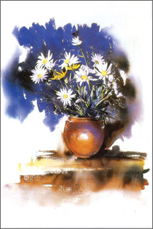
Flowers viewed from the back can be just as interesting as those
viewed from the front. Spontaneous brush strokes and lost and found
edges give a sense of natural living forms. Here the 'flower vase' the
artist has painted the daisies and gypsophila with masking fluid-to
preserve the white of the paper, then brushed in a dark background of
ultramarine and burnt sienna. As my work often requires extremely
delicate washes of colour, I always try to use colours that do not fade.
Colours play such a crucial part in the accurate portrayal of flowers
that I make certain that the colours mixed on the palette are correct
before applying them on to paper.
I most often use scarlet lake, vermilion, lemon yellow, burnt umber,
burnt sienna, vandyke brown, hooker green, ultramarine blue to paint
flowers.
For detail work I use No 1, 2 and 3 sable hair brushes and for washes
No. 8 or 12. When choosing colours, avoid the more opaque one such as
yellow ochre in favour of the really transparent ones like alizarin
crimson, lemon yellow and rose dore.
How to see
Floral still life-inspired another series of painting. Pattern flow
and subdued colour are the sources of inspiration. Each time you work at
a variety of attempts from the original theme, you learn to see better.
Variations of a theme are common in music, so why not in art?
www.tissahewavitarana.com |


")