Basic techniques in watercolours
Tissa Hewavitarane
Each artist and teacher has his own pet methods for getting students
started in watercolours, which seems to work best for him. There is no
single "best way" to get going. Teachers have to try several ways and go
with the methods that seem to accomplish their purposes.
 Wash Drawing as introduction Wash Drawing as introduction
Jumping directly to wet watercolour can often produce fear, a feeling
of helplessness, or a reverting to grade school practices. Several days
(or longer) working with wash drawings, stressing value contrasts and
wet-in-wet techniques, is often valuable in overcoming these problems.
Line can be included in the process or not, but the use of limited
values of wash tend to create the correct attitude toward the
transparent application of colour.
Still life or student models make excellent subject matter for such
drawings, and for later watercolours. Keep the values limited to three
plus black, and work from lightest areas to darkest. Note the effect of
wet into wet areas, wet over dry, white space left untouched and
contrasts obtained by overlapping washes.
Work quickly and loosely to establish a painterly quality. Explore
methods of stimulating textures by spattering or allowing drips to run
their course. Keep painting sessions relatively free of restrictions so
that exploration can take place and discoveries can be made.
Succeeding steps might involve the introduction of one or two colours,
while keeping the subject matter and work methods the same. Apply colour
washes over the three-value ink wash drawings.
Substitute watercolour for the washes, but work in the same manner.
Keep the first pallettes limited in colour and stress transparency,
overlapping and textural effects.
Emphasis on Water (Washes)
It seems improbable that student watercolours are often made with
very little water. But this is so. Washes should be prepared in
containers that will hold plenty of water, not only thimbles full.
Painted washes are continuous areas of watercolour that take more than a
single brush stroke to apply.
Succeeding strokes (of either colour water) should be made at the wet
edges to spread the colour area. All must be done rapidly to keep the
tones of the wash even. Colour and value changes can be made while
applying washes, but try not to scrub or overwork a good wash - it will
just be destroyed.
Ways to start a watercolour
Since no two artists paint exactly alike, they don't follow the same
procedures in developing their work. But several steps might help get
things started. Classrooms often provide still life and model material,
while sketch books, and imagination can add hundred of ideas.
So the subject matter is chosen first. Small pencil sketches are
valuable in preparing the composition of major elements. Here is where
arranging and re-arranging should take place. Plan the design and
provide for the centre of interest. Make several quick studies and
select the one you like best. Transfer the sketch to the drawing paper,
taking care to keep the same proportions as in the rough sketch done
earlier.
The subject can be out lined in pencil with the line later becoming
an integral of the painting. Don't get too fussy with detail in the
drawing, concentrating instead on the placement of large shapes only.
Beging flowing light colours on in large areas with a big brush. The
general colour of the area being painted. Use big strokes and don't
worry about details. Wash in allsky and large shapes, negative and
positive. Let areas dry before continuing unless you purposely want them
to run together.
Dark areas are added next, working from light to dark. Paint colour
and value shapes only-not leaves, boards or windows.
When these areas are dry, the details can be painted in with smaller
brushes in dark values. Colour areas can be altered by applying colour
washes over them, and textures line and characteristic features can be
added.
Observe shadows fall and give a darker wash over the darker value
areas. Use a similar grayed colour for all shadows washes in the same
painting with slight modifications.
This will tend to pull the painting together and produce a more
united result. Don't over work the surface! Don't scrub! Don't apply too
many washes over each other, or muddiness will result! All the don'ts
seem to apply to doing too much of something to the painting.
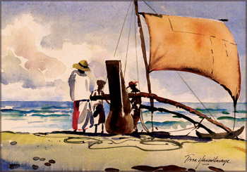
Notice the scene related to this article. I have titled "Getting
ready for the catch." A perfect example of how the use of water colour
with controlled freedom.
Here the simplicity is the key note. Observe the human figures
(fishermen). Often figures are used in a painting to show scale, or
relative size and balance.
The eye is always drawn to human figures in a landscape and their
inclusion can turn an ordinary subject into a striking picture.
Here the three figures form the anchoring point for the whole
composition. We look first at them, then, following the gaze, we explore
the landscape beyond.
The focal point on this picture is the fishermen, and the boat, I
have not shown any details of the fishermen nor the boat. Kept simple.
The clouds become smaller, flatter and lighter in tone as they near the
horizon. Warm blues bring the foreground sky closer.
Techniques
Fluid and transparent, water colour is tailor made for painting
reflections in water. There are number of techniques you can use
depending on the effect you want to convey. Various artists use variety
of styles and techniques in approaching the painting.
Washes, loose painting careful studies, sketchy drawings, design
concepts and casual likeness are all proper techniques that could be
applied. Notice the sea in the painting. I have emphasized the smooth
glaziness of the water and the waves through the use of strong contrasts
of light and dark tones. Transparent glazes are applied on top of the
other to build up depth of tone and colour.
Many books tend to promote a single point of view, a single artist's
work or how-to-do-it approach. There are hundred of ideas to turn water
colour lessons into high adventure to help in the exploration and
discovery processes. And that is what art teaching is all about. |